Advanced Typography : Task 01 / Exercises : Typographic Systems & Type & Play
Advanced Typography GCD61004
NAME: Sea Hirayama
I.D: 0347596
COURSE: Bachelor of Design in Creative Media / Taylor's Design School
●Lectures
Week 01 :
We did shortly brief with MIB and were taught what we'll do on task 1
with learning typographic systems. Also, we're told that we need to prepare
e-portfolio.
Week 02 :
After we got feedbacks for typographic system exercise, we were taught the
next task we'll do. Mr Vinod taught us why we do for the next task. It can
show us the process of making typography, origin and how to get inspire from
something to create new typography.
Week 03 :
For the exercise of type and play, we got some feedbacks and time to
explore in a class. Also we were given another task, type and image to
create a typographic poster with picture.
Week 04 : No Lecture
Week 05 : No Lecture
●Lectures(Prerecorded lectures on YouTube)
Typographic systems:
There are eight major patterns of typographic systems, an infinite number
of permutations. It is for fundamental of design and the structural
system.
・Axial system
It is made by one line. We can made it both side, but it's needed
to be with the line even if the line isn't straight.

Figure 1.1 Sample of Axial System(01/04/2022)
・Radial system
We need to focus on the line from circle. It's kind of difficult, but shows
exiting!

Figure 1.2 Sample of Radial System(01/04/2022)
・Dilatational system
It's require to made it along the circle line like this.

Figure 1.3 Sample of Dilatational System(01/04/2022)

Figure 1.4 Sample student's design of DilatationalSystem(01/04/2022)
・Random system
We can put the sentences randomly. It can shows more complicate that is why we
are require to make it good balance as well.

Figure 1.5 Sample of Random System(01/04/2022)

Figure 1.6 Sample student's design of Random System(01/04/2022)
・Grid system
It made by grid. It can shows simple, clear. We can make it with a few
boxes as well.

Figure 1.7 Sample of Grid System(01/04/2022)

Figure 1.8 Sample student's design of Grid System(01/04/2022)
・Modular system
It's kind of similar to random system, but it can show the flow of
sentences. It can made by the tool of alone the line.

Figure 1.9 Sample of Modular System(01/04/2022)
・Transitional system
It shows similar to grid system, but it needs to separate boxes like
this. Within the box, it can be created flexibly.

Figure 1.10 Sample of Transitional System(01/04/2022)

Figure 1.11 Sample student's design of Transitional System(01/04/2022)
・Bilateral system
It's needed to alone with a few lines. It needs to focus on the center of
the line as well.

Figure 1.12 Sample of Bilateral System(01/04/2022)

Figure 1.13 Sample student's design of Bilateral System(01/04/2022)
InDesign Formatting :
Mr Vinod taught us how to prepare to create with InDesign. I could
learn some tool details as well. For this, I could know how to put the
page next one. Also, I just learned about InDesign again with studying
about margin.

Figure 2.1 Screen shot of learning how to move
page(02/04/2022)

Figure 2.2 Screen shot of learning about
margin(02/04/2022)
For this, it shows changing figure size. I was really surprised this
that looks better than normal. I learned about change "–" and "-" as
well.

Figure 2.3 Screen shot of learning make figure
shortly(02/04/2022)
Exercise Typographic systems:
I could know about modular system a lot from this lecture. It can show
the design clearly and nice with knowledge of this basic.

Figure 3.1 Screen shot of learning about modular
system(02/04/2022)

Figure 3.2 Screen shot of learning how to organize
it(02/04/2022)
Typographic Composition :


Context and Creativity :
Designing Type :
Perception and Orgar :
Illustrator to FontForge :
●Exercises : Typographic Systems (Week 01-02)
-Idea exploration
So for this task, I did without some sketches because I wanted
to focus on typographic system clearly and directly. When I came
up my idea, I just explored it as well. It was really fun to
create eight type of design. To add, I supposed that this task
is really important for designer to create some such as
poster.

Figure 4.1 The process of design without sketches(03/04/2022)

Figure 4.2 The process of thinking about design with
grid system(03/04/2022)


Figure 4.3-6 The process of thinking about
design with Axial system(03/04/2022)


Figure 4.7-8 The process of thinking about
design with Dilatational system(03/04/2022)


Figure 4.9-10 The process of thinking
about design with Random system(03/04/2022)


Figure 4.11-14 The process of
thinking about design with Grid
system(03/04/2022)
– Final Design

Figure 5.1 The final design for Axial system -
jpg(03/04/2022)

Figure 5.2 The final design for Radial system -
jpg(03/04/2022)

Figure 5.3 The final design for Dilatational
system - jpg(03/04/2022)

Figure 5.4 The final design for Random
system - jpg(03/04/2022)

Figure 5.5 The final design for Grid
system - jpg(03/04/2022)

Figure 5.6 The final design for Modular
system - jpg(03/04/2022)

Figure 5.7 The final design for
Transitional system - jpg(03/04/2022)

Figure 5.8 The final design for
Bilateral system - jpg(03/04/2022)

Figure 5.1 The final design for typographic system exercise -
jpg(03/04/2022)
Figure 5.2 The final design for typographic system exercise -
pdf(03/04/2022)
●Exercises : Type & Play (Week 03-04)
For this task, I selected the picture of fire. It shows
interesting shapes. To add, fire never shows same shape, just the
moment that is why I thought that I can create the type which
isn't similar with other types. So, I picked some screen shot from
the video to do sketch this time.
Figure 6.1 The process of screen shot from the video(08/04/2022)
Then, I found letters "H", "B", "E" and "S" from fire. After
I decided the type, I tried to trace them in Adobe
Illustrator.


Figure 6.2-5 The base pictures for tracing in
Illustrator(08/04/2022)
Finally, It shows like these type. It's so cool shape and
seems a bit trembling, scary mood.

Figure 6.6 The process of screen shot in
Illustrator(08/04/2022)
Figure 6.7 The final design for sketch - PDF(08/04/2022)
After I let it emerge from the movement of fire, I tried to find
the type which is similar to my design, then I got inspiration as
well. I found the type – Shadow Of The Death from Font meme. It
shows mood of scary and horror. But, I supposed that I would like
to create it without that kind of imagination, create it with
modern design. So I tried to focus on the entire shape of font,
then made them within the square shapes. It could show interesting
type with simple and clear shape. I just liked it.

Figure 6.8 The screen shot of process of creating
type(10/04/2022)

Figure 6.9 The screen shot of trying use blending
tool(10/04/2022)

Figure 6.10 The screen shot of process of making it
bold(10/04/2022)

Figure 6.11 The screen shot of process of creating
type within square shape(10/04/2022)

Figure 6.12 The screen shot of process of creating type
within another square shape(10/04/2022)
For week 4, I decided to go with it in one shape, and
create more smooth line. I tried to express type melting
as well. After I finish designing, I just created it
with image like poster for fun.

Figure 6.13 The screen shot of process of final
design in week04(16/04/2022)


Figure 6.14-16 Final design in week04(16/04/2022)

Figure 6.17 The poster for example in
week04(16/04/2022)
Figure 6.18 Final design in week04 - PDF(16/04/2022)
After I got feedbacks for increasing the part of
sharp a little bit bold. I tried re-design it. From
this exercise, I could learn the origin of creating
type and how difficult it is although I enjoyed it.
Figure
6.19 Final design - PDF(22/04/2022)
●Task 01 : Type and Image
For this task, we are required to create a poster
with picture and typography. We need to marge the type
in picture with smoothly and clearly learning the
balance and some rules.
So I picked up some images from Pinterest, then I
tried to put type in it smoothly. I got some method of
putting type clearly from instagram and youtube as
well. It's kind of difficult for me to do it, but I
just enjoyed creating it like poster.


Figure 7.1-2 The first outcome of the
poster / part 1 - jpeg(16/04/2022)


Figure 7.3-4 The first outcome of the
poster / part 2 - jpeg(16/04/2022)

Figure 7.5 The final design / part 1 -
jpeg(22/04/2022)

Figure 7.6 The final design / part 2 -
jpeg(22/04/2022)
Figure 7.7 The final design / part 1 and part 2 -
PDF(22/04/2022)

Figure 7.7 The final design / part 1 - jpeg(22/04/2022)

Figure 7.8 The final design / part 2 - jpeg(22/04/2022)
Figure 7.9 The final design part 1 and part 2 - PDF(22/04/2022)
●Feedback
Week 01 :
General feedback
We did shortly brief with MIB and were taught what we'll do on task 1 with learning typographic systems. Also, we're told that we need to prepare e-portfolio, blogger.
Week 02 :
General feedback
We got some feedbacks of Typographic system exercise. There were alot of kind of design, so I really enjoyed it and got inspiration. Also We're required to know what we do for next task. We can focus on how to make typeface, create new own typography. It sounds really difficult and interesting. I'm just looking forward to explore my idea of typography more and more with learning the origin of typography as well.
Specific feedback
All most of design were good, but I need to check spelling more....I realized again that I need to study English more. Anyway, I learned again about the size between sentences and figure as well. I should to think about the type size and its balance.
Week 03 :
General feedback
We got feedbacks for Type and Play exercise. We're
required to know the next task as well. During the
class, we were given the time to explore our design
and get feedback for it.
Specific feedback
The picture I selected (screen shot of the fire
movement) is good. Also the type I make it emerge is
good as well. So I can explore it more and more with
some visual research and so on.
Week 04 :
General feedback
We got feedbacks for the exercises of type and
play, type and image. I just enjoyed seeing kinds
of type that someone created.
Specific feedback
For the exercise of type and play, it's the part
of sharp needed to be a little bit bold. Almost of
all is great. I got ”素晴らしい!(subarashii)" by
Mr Vinod :) Also for the exercise for type and
image, one of them need to be more sharp type,
don't need to put on blur because the image is
kind of sharp and clear. The second one need to be
put on some shadow to make contrast between type
and image. Also it doesn't need to just sentences,
mean that I can put the type randomly.
Week 05 :
General feedback
We got feedback for task1, type and play. After that, we got explanation of next task.
Specific feedback
Almost all of design is good. But also it would be better to re-create the design part 1. I can focus on the shape and position of type as well.
●Reflections
>Experience
For these exercise and tasks, I could learn the process of creating type face and the fundamental type formatting. I felt that it is really important for us as designer to focus on these and explore the design. Also I really enjoyed this time learning some skills of InDesign as well.
>Observations
I just realized that the color of type, type face and size are really important to create some mood.
>Findings
I got the skill of overlay the type to merge the image in Illustration
>Further readings/references

There is information of seven essential typographic layout systems. To add for lecture, I could learn about fundamental of type formatting as well.
Typographic Systems: 美しい文字レイアウト、8つのシステム
It show great design for typographic system as examples. From this book, I could explore the design for doing this task.

世界の最新タイポグラフィックデザイン : Latest typographic design from around the world
Captures the trends and current directions of modern typography, from print media such as magazines, books, brochures and posters to signage systems, CI, VI and digital materials.

Pioneer of Swiss Graphic Design
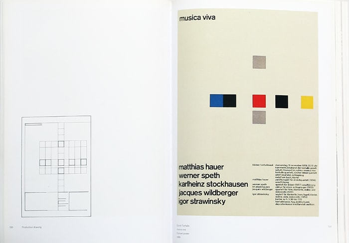
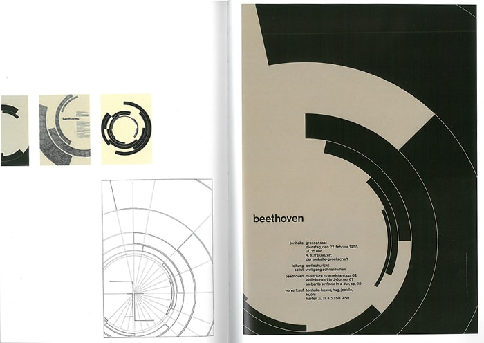
True to its title, Swiss Graphic Design Pioneer, the book features a number of works by Josef Müller-Brockmann in all-colour. The concept of the grid system developed by Brockmann plays an effective role in controlling typography's original purpose: to give order to the individual elements and convey information appropriately.

Neue Grafik (New Graphic Design) was founded in 1958 by four designers, Richard Paul Lohse, Josef Mueller-Brockmann, Hans Neuburg and Carlo Vivarelli. The grid system also worked for the layout of the three languages - German, English and French.

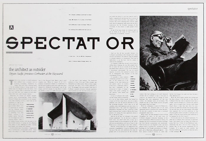
The Graphic Language of Neville Brody
Neville Brodie, who rose to prominence as art director of THE FACE and for his record jacket designs, was one of the first in the UK to use computers and incorporate original typography and logos into magazines in the 1980s. The large titles successfully guided the eye, and the abundant use of original typefaces established a groundbreaking visual expression that could not be found anywhere else.


アイデア別冊 タイポグラフィ・トゥデイ : Ideas Supplement, Typography Today.
Helmut Schmidt's work, from the collection of materials to their organisation, makes this a highly valuable resource as a typography book.
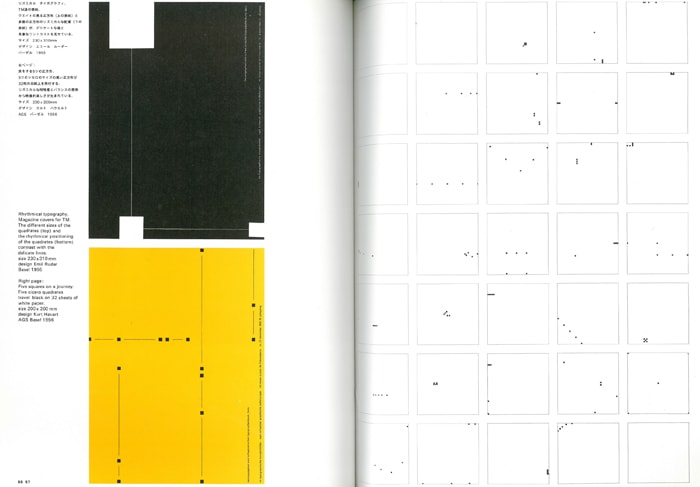
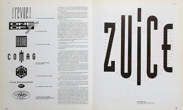
Cover of TM magazine. Rhythmic visual fun with contrasts of squares of different weights and delicate lines.

Typical constructivist arrangement by El Lissitzky.

Work by German artist Ferdinand Kliwet. The repetition of texts and motifs is striking.
For a collection of his work, see:.
It contains works by typographers from all over the world, along with explanations of their work, such as 'What is the intention behind the work? and "What is typography?" and "What is typography? It shows how all designers are searching for new ways of expression, even if they see it in different ways. At this point, it may be almost the realm of scholarly research.The words of Helmut Schmidt, who compiled the book, albeit from 1980, are also suggestive.
Typography must be heard.
Typography must be felt.
Typography must be experienced.
Today's typography is typography that expresses, not just places.
It's difficult, Mr Schmidt.
Comments
Post a Comment